
I like to read the backs of baseball cards. Not satisfied with the numerical order provided by manufacturer checklists, I have made a multi-decade habit of sorting sets by position, team, height, weight, batting average, homeruns, and overall player ranking. At some point I started enhancing these activities with the creation of massive spreadsheets that made quick work of the task at hand. It was not long after that I began adding dashboards that allowed me to virtually flip through my cards and to look at the contents of a set in more interesting ways.
Those dashboards long predated the creation of this website, which I hope to one day build out enough to capture some the files’ aesthetics and functionality. I spent the earlier part of this month retooling some of these items and took the opportunity to port over to CardBoredom the player infographics I use in my internal files. This is the first step in a multistage process that should bear additional benefits across the next 12-18 months.
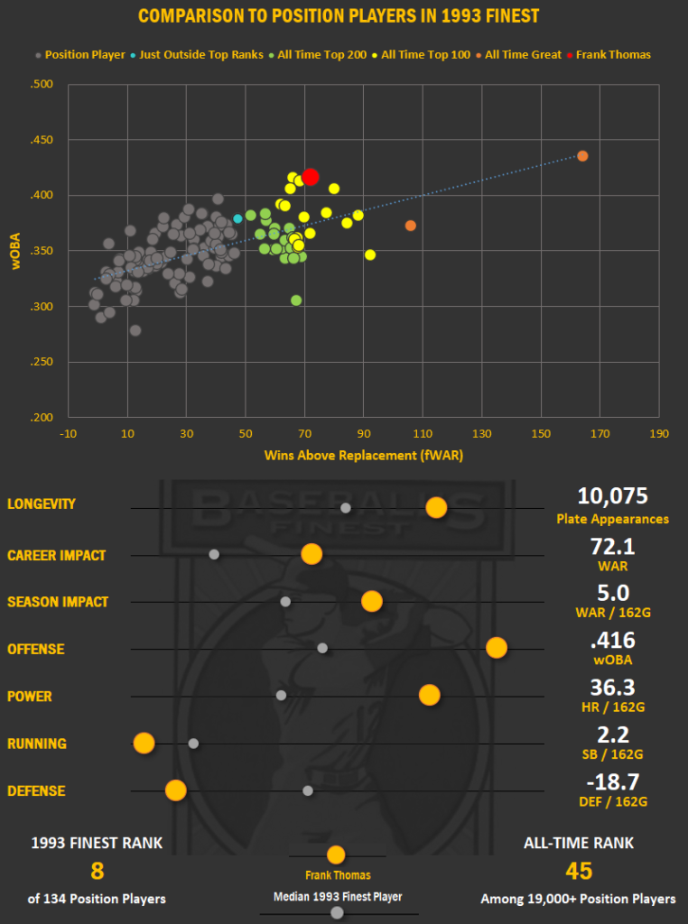
If you’re a regular reader, you will be familiar with the scatter plots I use to visualize player performance against the other names appearing in specific baseball card checklists. The illustrations worked well to get across the general capabilities of a player, but were not always intuitive. The bottom half proved particularly unwieldy in practice with the amber dot sliders often losing context as they became distorted by statistical outliers. The effect was something that sorta worked, but only in the eyes of someone familiar with the underlying spreadsheet mechanics. In short, it was a nice attempt but in practice a bad example of data visualization.
Player Summary 2.0
Those clunky graphics are now gone, having been replaced with something a bit easier on the eyes. Player names are now prominently featured, leaving little doubt as to whose statistics are being pondered. My favorite metrics of player performance are front and center with orange highlights and a large font. Player ranking (methodology here) also gets prominent billing, both against all-time MLB performance and the checklist from which the baseball card depicting them hails.
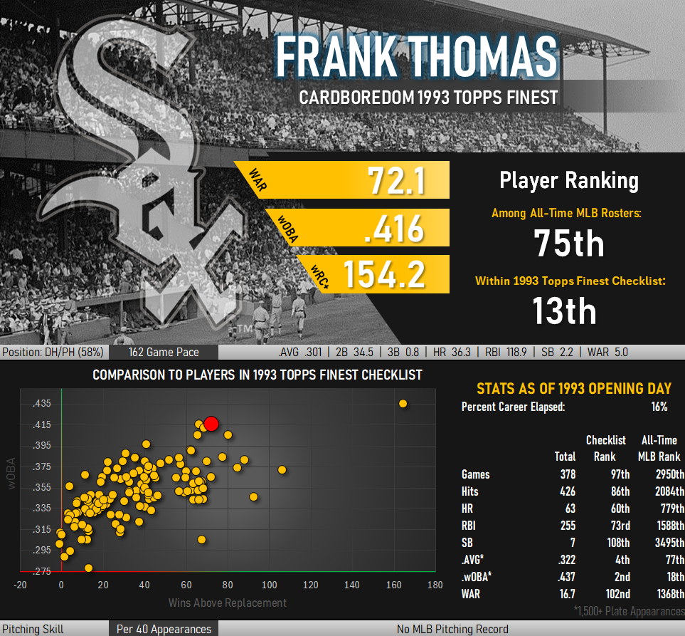
Those problematic sliders have been replaced with a silver colored stat line across the middle of the image. Performance is shown on an annualized basis with position players starting a full season of 162 consecutive games and pitchers taking the mound every 4th start for a total of 40 appearances. Leading off this line is an indicator of what role a player most played during his career with the percentage of his career played at that position appearing in parentheses.
Another silver stat line is positioned at the bottom of the image. This displays annualized pitching performance for position players who at times found themselves performing pitching duties. Annualized batting records likewise appear in this region for players who primarily pitched.
The familiar scatter plot remains intact, though it has been improved with color coded gradients along the axes providing context as to which direction data points become more favorable. Green indicates favorable performance while red translates to less favorable. As in the earlier iteration, the player being reviewed appears as a large red dot amid a sea of amber peers in the plot.
To the left of the scatter plot is a summary of how a player’s stats stacked up at the outset of the season in which his baseball card was issued. The percentage of a player’s career that has elapsed is given, as measured by the number of games counted in these stats compared to their final career total. Cumulative career stats through Opening Day are shown and ranked against the other players in the checklist through the same point in time. Totals are likewise ranked against the all-time MLB record books at the same point in history.
More Improvements Are Coming
Other changes are planned that should provide further information and ease of use. These will be rolled out as time permits, given that the infographic project and other real life priorities have kept me from posting anything new in the last five weeks. On the list for a refresh are better card photography, a more detailed ’93 Refractor dashboard, the addition of a formalized player collection section, and the introduction of a video component.