I am still gathering large amounts of information in my quest to learn about the 1993 Finest Refractor set. Some of this seems basic, but there is a substantial amount of incorrect information floating around about these cards. Topps didn’t spend much time talking about refractors when they debuted, choosing instead to leave much to collectors’ imaginations.
Today, YouTube videos of eager collectors opening packs are filled with people initially confusing the All-Star subset with refractor parallel inserts. Random searches of current eBay listings will easily yield obvious non-refractor cards being advertised as refractors. Some of these listings are sure to be dishonest, but there are probably a good number of honest mistakes in the mix.
Last year I traveled to a few card shows, spending time in setups ranging from small hotel event rooms to the giant expo center hosting the Chantilly show. At each event I canvassed dealers for any refractors they had or at least a good story about them. One team of vendors had a large stack of graded ’93 Finest base cards on display. They told me they didn’t know how to identify a refractor on sight and instead just submitted the entire pile to third-party grading services as refractors and let them sort it out. To the graders’ credit (shoutout to good identification by CSG!) all were apparently corrected and properly labeled as the much more common base cards.
Not every case of mistaken identity gets caught by third party experts. I have seen a refractor card of Ivan Rodriguez labeled by PSA as a base card. In March I purchased a Greg Maddux refractor only to receive a base card inside a PSA slab. Another mislabeled Mike Piazza was sold on eBay just this month.
I personally experienced the introduction of the earliest refractors and can understand the confusion. Attending one of the ubiquitous mall-based card shows of the early 1990s, I found myself handing over $5 for a pack of just released 1994 Finest. Opening the cards, I quickly realized I had no idea what I was looking at (sound familiar to opening packs today?). One card looked different than the rest and I asked a nearby dealer if it was a refractor. He informed me that it was not and that I was in possession of one of the set’s “Finest Rookies” subset from the regular issue. He fanned out the remaining 5 cards from my pack and pushed a Phillies pitcher out of the lineup and across the table to me. “Here’s your refractor,” he said before handing me a top loader and explaining how to tell it apart from the rest.
Identifying Refractor Versions of Base Cards
Topps didn’t make it easy to identify the first refractors. There is no writing or alternative numbering on cards indicating they are any different from the regular edition versions comprising the Topps Finest set. As far as I can tell, Topps’ own promotional materials for the set didn’t even show an example of what a refractor looked like. During the premarketing phase of the set, Topps scattered a handful of very hard to find refractor versions alongside its three-card promotional sample set. Even these promo refractors seem to have been a surprise for recipients rather than something hopeful collectors could use to make easy comparisons.
The first step to identifying a refractor is becoming familiar with the base version of ’93 Finest. All ’93 Finest cards have extremely deep layers of gloss, often deeper and shinier than what is encountered in modern Topps Finest issues. The cards are printed using the chromium printing process that is so familiar to collectors of Topps and Bowman Chrome cards of today. As such, the card exhibits design elements that reflect light in a metallic method throughout the front of the card. This effect is most noticeable along the borders, which will shimmer in hand among various shades of silver. Similar reflective effects will be seen in other areas of the card front with different color sections changing in their intensity. “Shiny” is the first adjective that comes to mind when holding one of these cards.
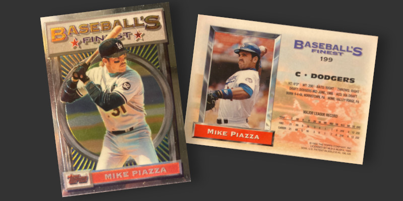
Shown below as an example is a base Mike Piazza, a card popular enough to be encountered on display alongside much scarcer refractors. Notice how the silver borders on the front range from a mirror-like white in the upper left to a very dark graphite tint in the bottom right. Reflections can appear in the card surface, as evidenced by a blurry image of one of my fingers reflected in the bottom left near the Topps logo.
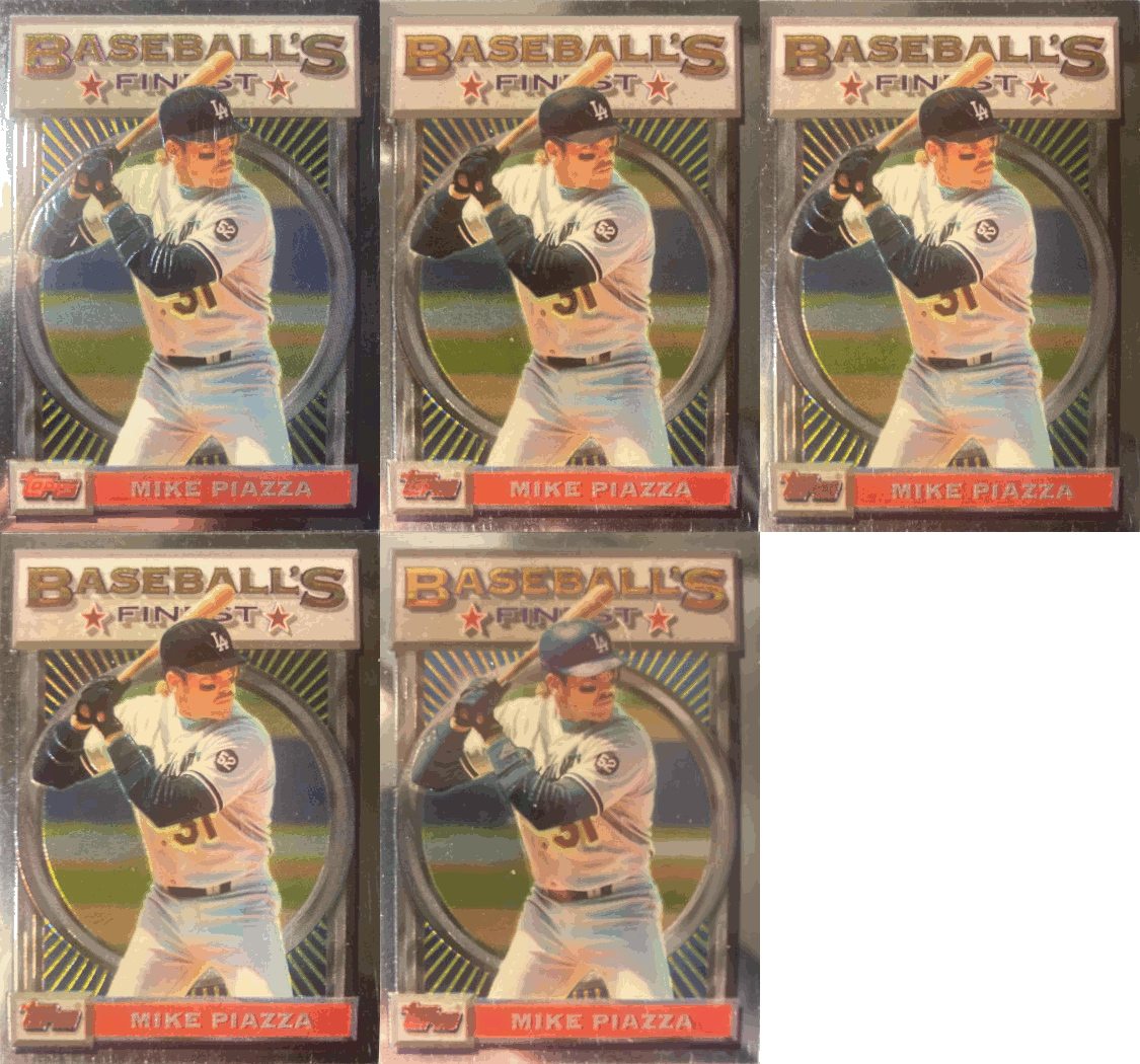
The image below shows the same base Piazza card from different lighting angles to highlight how light interacts with the set’s regular cards. The card is very reflective, but individual design elements (borders/background/nameplate/etc) only change in intensity rather than an outright change in color. Some partially embossed photo elements like the brim of a hat, sweatbands, and folds in uniforms may reflect with a different intensity, but the overall effect remains the same. Note that some areas have minor color gradients as part of the design, such as inside the interior coloring of the word “Baseball’s” and the yellow lines radiating outward from the circle in the middle of the card. All of these effects are seen in the regular non-refractor Finest cards from this issue. The presence of the gradient is part of the underlying design and does not represent the color change indicative of a refractor.
So how do actual refractors differ from these shiny cards? The back of the card can be ignored for identification purposes as there is absolutely nothing to contrast on that side between base and refractor versions.
Compare the above base card with the refractor shown below. When the angle of approaching light is changed, there is a notable shift in colors. Silver borders morph into greens/blues/purples/reds and oranges, as do most surface areas. Player skin tone and light portions of uniforms are exempted from this treatment and do not exhibit any change.
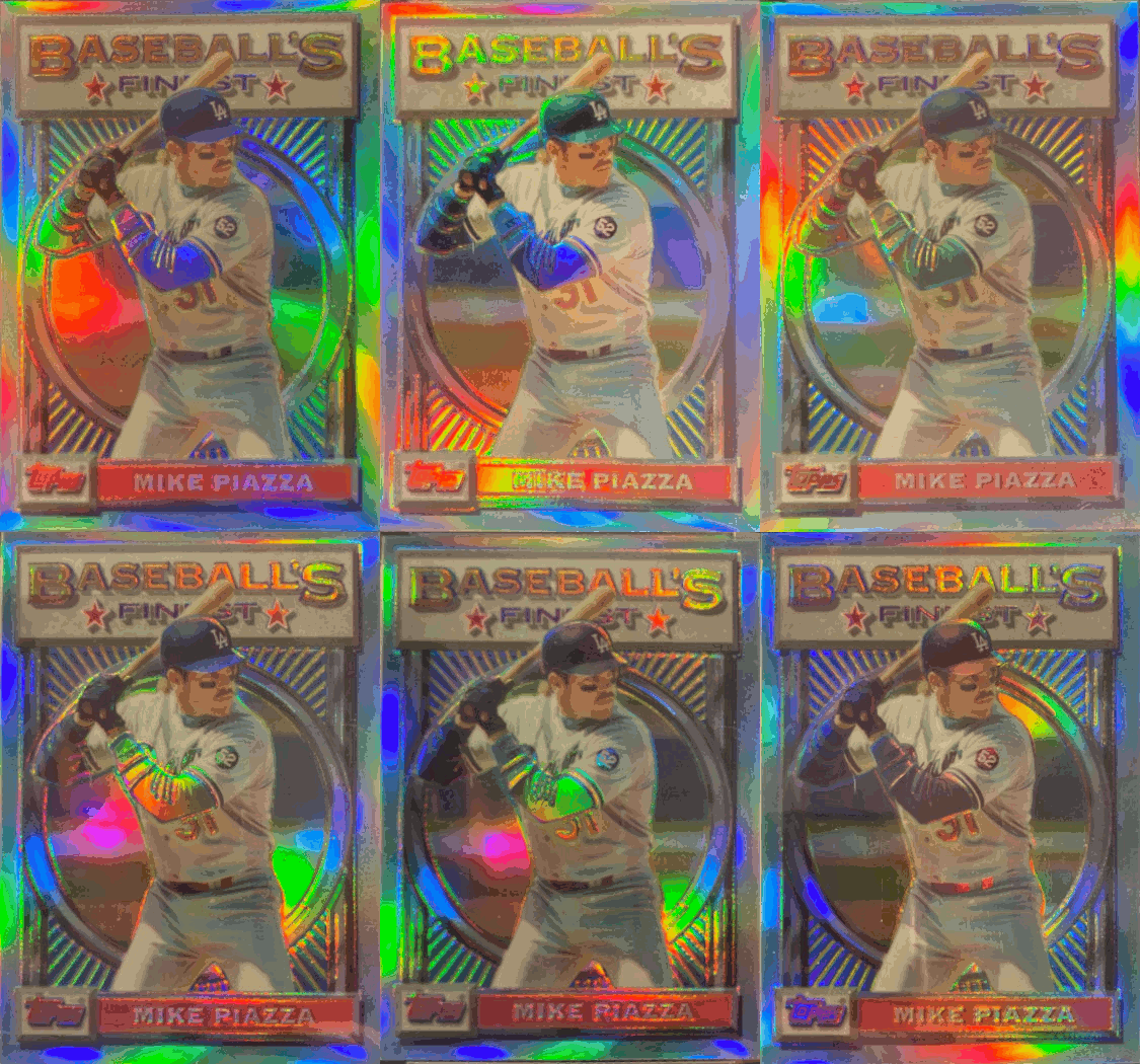
To best view this effect, examine cards in an environment with strong lighting. Hold them at an angle, changing the position of your wrist so that the angle of approaching light shifts. Look for movement of colors that should be particularly pronounced along the borders. Colors should change distinctly and not just be varying shades of the same hue or a shift in reflected brightness.
All-Star Refractors
The principal idea behind identification of the All-Star subset remains the same, though these cards tend to produce more confusion than the regular design. All-Star cards typically (but not always) arrive one per six-card pack. Newcomers, like the 1994 version of me, can easily make the mistaken assumption that these different looking cards must be refractors. Furthering this error, eager collectors hunting for a rainbow hue immediately home in on the rainbow design element in the background.
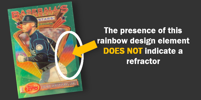
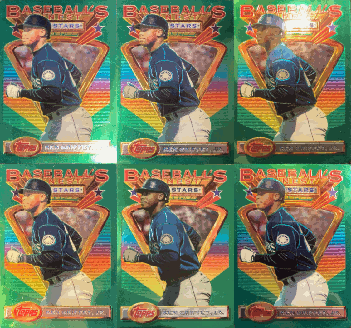
So how does one identify an All-Star refractor over the base version? Once again, the card will need to be viewed at multiple angles in a strong light. The player nameplate at the bottom will simply reflect differing amounts of light on base versions while the same area on refractors will produce a full rainbow of colors as the angle of approaching light changes. A regular card’s dark green background will show a very impressive hue that reflects light in much the same way the paint and finish would on a new car. Refractors, on the other hand, will produce much bright shades of green with brief appearances of other colors. There is little change in the triangular background behind the player on base cards while the same area of refractors absolutely pop with the full spectrum of colors. Exposed skin and light portions of uniforms both react the same on base and refractors. Dark uniforms, however, produce vivid rainbow effects on refractors while only exhibiting variations of the same color on base cards.
These effects are best seen when a base card is compared directly against a refractor. Below appear both a base Ken Griffey, Jr. card [top] and the refractor [bottom].
BASE CARD:
REFRACTOR:
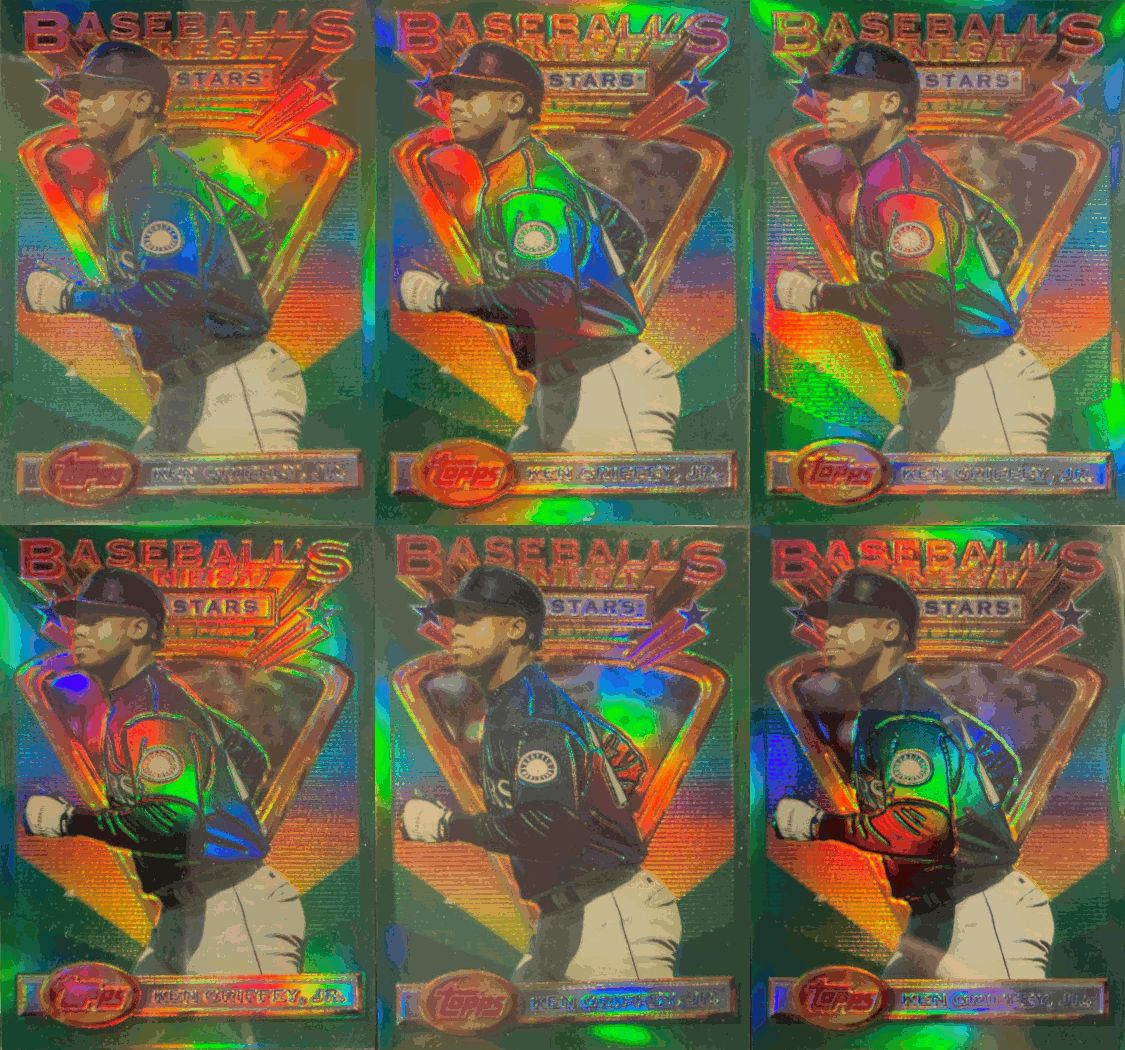
Side by side the difference becomes readily apparent.

