
I want Pollet on the mound 9 out of 10 times we take the field.
A made up quote that sounds like it came from one of Howie Pollet’s managers
I tried to find a real quote from one of Howie Pollet’s contemporaries but didn’t find one that lent itself well to the story I already had in mind. As a result, I made one up. I’m a rando on the Internet, not a journalist.
It’s not that the usually even-keeled pitcher did not generate his share of praise. Branch Rickey said of him, “…He knows how to pitch and can put the ball just about where it should be pitched.”
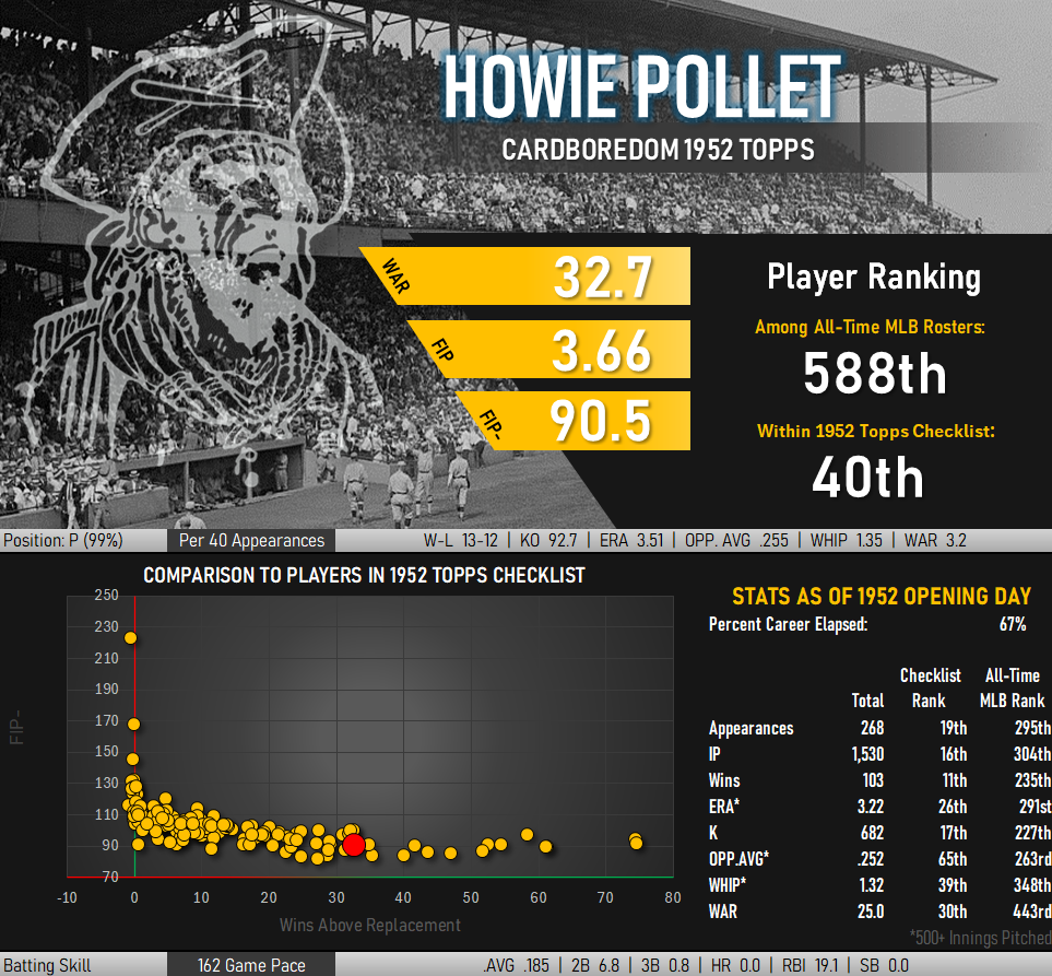
More importantly, Pollet’s stats spoke loudly in his favor. This was, after all, a pitcher who captured a pair ERA titles. He threw a no-hitter. There were a pair of World Series championships to go along with a second place finish in 1946 MVP voting.
The back of his 1952 Topps baseball card reflects this success through 268 career games in the stat line on the back of the card. Given this performance, collectors opening packs in that era would have been happy to find his card. This extent to which this becomes clear when his first 268 games are compared against the same span of “baseball card stats” from a half dozen top-flight pitchers of different eras.
| Pitcher | G | IP | W | L | W/L % | H | R | SO | BB | ER | ERA | FIP- |
|---|---|---|---|---|---|---|---|---|---|---|---|---|
| Warren Spahn | 268 | 1,931 | 127 | 92 | .580 | 1,725 | 744 | 1,017 | 598 | 650 | 3.03 | 86 |
| Virgil Trucks | 268 | 1,531.1 | 105 | 75 | .583 | 1,365 | 655 | 903 | 608 | 584 | 3.43 | 86 |
| Fernando Valenzuela | 268 | 1,954.2 | 118 | 91 | .565 | 1,699 | 785 | 1,536 | 744 | 690 | 3.18 | 88 |
| Howie Pollet | 268 | 1,529 | 103 | 75 | .579 | 1,494 | 643 | 682 | 524 | 548 | 3.23 | 89 |
| Tommy John | 268 | 1,608 | 84 | 91 | .480 | 1,482 | 636 | 962 | 501 | 536 | 3.00 | 89 |
| Tom Glavine | 268 | 1,759 | 126 | 85 | .597 | 1,686 | 766 | 1,062 | 588 | 687 | 3.52 | 92 |
| Johnny Sain | 268 | 1,681 | 106 | 92 | .535 | 1,693 | 756 | 725 | 515 | 651 | 3.49 | 94 |
Pollet ranks right in the middle of this group when ordered by adjusted fielding independent stats (FIP-). Those without access to such a metric would be hard pressed to separate his performance from those in the table around him.
What Does 9 Out of 10 Actually Look Like?
Pollet was obviously a solid starting pitcher through his first 268 games and was very respectable through 403 regular season contests. But what about that made up quote from a made up manager? If you really could have Pollet pitch in 9 out of 10 games, how would he fare? And, if you had waaaaay too much time on your hands, what are different ways that 90% of Pollet’s games could be described?
***Note: I’m just playing around with some game log information and not trying to really find some sort of deeper conclusion from these numbers.***
Generally people who make such wishes are thinking about a player’s best outings and not the occasional blowup on the mound. I reached back into his game logs and sorted each appearance by his game score to find his 363 (90%) best outings. Pollet’s baseball card stats subsequently improve.
| Pollet Performance | G | IP | W | L | .PCT | H | R | SO | BB | ER | ERA |
|---|---|---|---|---|---|---|---|---|---|---|---|
| Full Career | 403 | 2,107.1 | 131 | 116 | .530 | 2,096 | 957 | 934 | 745 | 821 | 3.51 |
| Best 90% | 363 | 1,980 | 125 | 90 | .581 | 1,826 | 746 | 895 | 660 | 628 | 2.85 |
Who wouldn’t want a pitcher with a 2.85 ERA and almost 6 innings of work per game? Of course, these stats are a bit misleading. Pollet’s best 9 out of 10 appearances are being judged through the lens of the performance standards of all other players’ full careers. If the worst 10% of outings were tossed we would approach determination of pitching success with much tougher hurdles. A sub 2.50 ERA could be the new sub-3.00 mark, for example.
Taking away Pollet’s 40 least impressive games is a best case scenario. What would his stats look like if his 40 best games never took place?
| Pollet Performance | G | IP | W | L | .PCT | H | R | SO | BB | ER | ERA |
|---|---|---|---|---|---|---|---|---|---|---|---|
| Full Career | 403 | 2,107.1 | 131 | 116 | .530 | 2,096 | 957 | 934 | 745 | 821 | 3.51 |
| Best 90% | 363 | 1,980 | 125 | 90 | .581 | 1,826 | 746 | 895 | 660 | 628 | 2.85 |
| Worst 90% | 363 | 1,746 | 90 | 114 | .441 | 1,899 | 934 | 755 | 683 | 805 | 4.15 |
These look like completely different pitchers despite an overlap of 78% of their games. The entire difference comes from just 80 games. A good way to strip away the impact of outliers is to only look at the middle of these 363 sample games via a trimmed mean. Keeping the same best to worst game score ranking in place, this method calls for removing the best 20 games and an equal number of the worst outings. The result is a set of statistics describing those middle 363 outings.
| Pollet Performance | G | IP | W | L | .PCT | H | R | SO | BB | ER | ERA |
|---|---|---|---|---|---|---|---|---|---|---|---|
| Full Career | 403 | 2,107.1 | 131 | 116 | .530 | 2,096 | 957 | 934 | 745 | 821 | 3.51 |
| Best 90% | 363 | 1,980 | 125 | 90 | .581 | 1,826 | 746 | 895 | 660 | 628 | 2.85 |
| Worst 90% | 363 | 1,746 | 90 | 114 | .441 | 1,899 | 934 | 755 | 683 | 805 | 4.15 |
| Trimmed Mean | 363 | 1,817 | 103 | 102 | .502 | 1,829 | 841 | 714 | 673 | 791 | 3.92 |
Ouch. Pollet’s middle games pretty similar to his least impressive outings. Taking a step back this makes sense, as 94% of those worst appearances fall inside the trimmed sample with the final 6% making up the difference. That same logic implies that the gulf between the trimmed mean and his best outings is explained away by the best 20 games of his career. When Pollet was at his best he was (on at least one occasion) unhittable.
A pitcher’s best and worst games are still part of his record, and both are pretty valid indications of what might take place the next time he takes the mound. They might not look like the other games, but they are still informative. Another way of looking at Pollet’s career is to not systematically remove the outliers but rather include them.
What if random number generators were used to select 10% of games to be excluded? You might get something that looks like this:
| Sample | G | IP | W | L | .PCT | R | H | SO | BB | ER | ERA |
|---|---|---|---|---|---|---|---|---|---|---|---|
| Random #1 | 363 | 1,887 | 114 | 100 | .533 | 845 | 1,875 | 849 | 661 | 721 | 3.44 |
| Random #2 | 363 | 1,915.2 | 115 | 107 | .518 | 872 | 1,907 | 845 | 683 | 747 | 3.51 |
| Random #3 | 363 | 1,833.2 | 107 | 108 | .498 | 852 | 1,827 | 823 | 664 | 728 | 3.57 |
This trio of 363-game samples produces similar overall profiles for Pollet. However, they are different enough that a reader could interpret them as being different players and could clearly rank them in order of performance. You could get closer to measuring Pollet’s abilities by repeating this process over and over and averaging the results. Here’s what this looks like after running multiple iterations of this experiment:
| Average of N Iterations | G | IP | W | L | .PCT | R | H | SO | BB | ER | ERA |
|---|---|---|---|---|---|---|---|---|---|---|---|
| 3 | 363 | 1,879 | 112 | 105 | .516 | 856 | 1,870 | 839 | 669 | 732 | 3.51 |
| 100 | 363 | 1,900 | 115 | 103 | .529 | 861 | 1,891 | 852 | 674 | 742 | 3.51 |
| 1,000 | 363 | 1,897 | 115 | 103 | .529 | 861 | 1,891 | 851 | 673 | 742 | 3.52 |
This gets you to a pretty good approximation of his career rate stats and within ~10% of his counting metrics. In effect, you wind up with the same stats that show up on the back of his baseball cards and that is one of the reasons why it is more fun to flip through cardboard than to sort and re-sort numbers in a spreadsheet.
What I would love to see added to cards and online databases is a new statistic that looks at variability of these numbers. Two pitchers can put together identical career totals with completely different paths of getting there. One could consistently put up average numbers for 20 seasons while the other is in line for a decade of Cy Young Awards bookended by a collective 10 years of abysmal performance. Which would be the better player? How would fans and card collectors react to these stats? Which would produce more winning seasons for his team? A single number measuring the volatility of performance would be an interesting concept to explore.
Thank you for coming to my Ted Talk.
Better Condition Than 9 out of 10 Cards in My Set
That’s the way I would describe the Howie Pollet card residing in my baseball card collection. I consider it to be VG or VG-EX condition with some corner wear and slightly wonky centering. That’s quite a step up from the Fair to Good average grade for cards that have so far comprised this set building project.
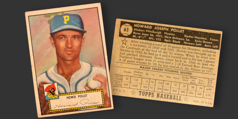
The front of this card is a bit different from the other 406 cards in the ’52 Topps checklist. For starters, the background seems to be portrayed as sometime around sunrise or sunset. I remember a funeral home in my hometown having a wall-length mural with an almost identical backdrop in one of its reception rooms. Maybe that’s why Howie looks a little down.
Similar to other cards in the set, there is some heavy artwork present in the name or presenting Pollet on the correct team. The original photo used for the production of this card has the subject dressed in a St. Louis Cardinals uniform. The somewhat open nature of the collar shows a little chest hair, something that always stands out as being a bit odd on cards that utilize heavily corrected portraits. The artist retouching the image changed the piping on the jersey from Cardinal Red to a more nautical blue, though the Pirates had not had anything resembling these prominent lines since 1947. The cap is likewise a fabrication, with a block letter “P” heavily flexichrome-painted over the St. Louis logo. The Pirates had not used any sort of blue in their hats since 1947, having ditched their blue and white color color scheme in favor of black and gold after just five years of use.