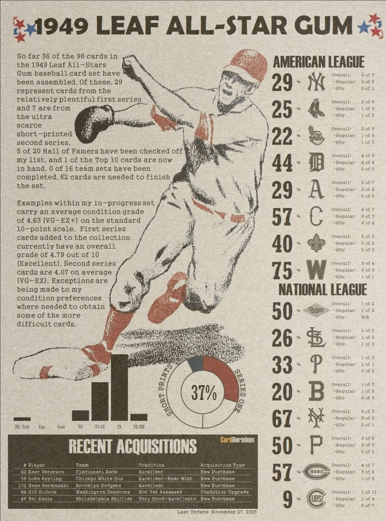
For some time I’ve been working on another set building project. Although mentioned a few times here and there, I haven’t devoted any formal writing to its contents. It’s time to change that.
No matter how many Pokemon cards and red and white PSA labels one sees in the showcases of a card show, there remain a handful of card issues that cannot fail to catch the eye. You’re drawn to them seemingly from across a room. Even if you already have one or have no intention of making a purchase, you can’t help but walk over to take an appreciative glance. These cards are art. T-206 cards have this effect, as do the ubiquitous Hank Aaron rookies and 1933 Goudey cards that fill case after case at any event attended by more than a handful of vintage dealers.
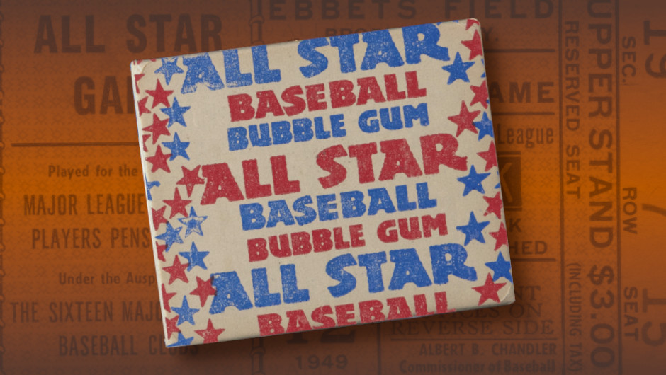
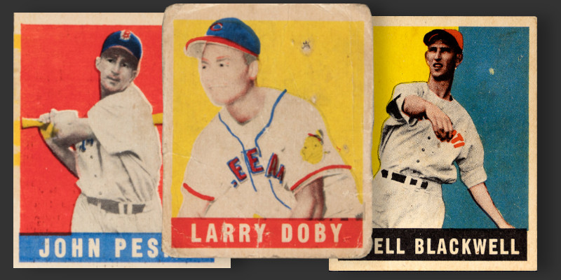
Even among these there is one set that always stands out. Printed in the most vibrant colors of its time is the 98-card 1949 Leaf issue. Their simple four color production (black, red, yellow, and blue) produces striking images that resemble, and may have even had a hand in the creation of, screen-printed pop art staples from artists like Andy Warhol. The cards are essentially a photo, lots of color, and the literally the biggest names to appear in the first century of baseball card production. Nothing looked like it before, and nothing has every really looked like it since.
CARDS MADE BY ACTUAL FANS
While Sol Leaf reportedly wasn’t a sports fan, his company’s foray into baseball cards was obviously led by someone who knew baseball and had collected cards. I think the design team grew up playing with the Goudey cards of the 1930s. Why? They tried to emulate them. Leaf cards were the first truly colorful cards since then.
After escaping the standard dimensions of cigarette packs, baseball cards as a product had diffused into a wide array of sizes. Goudey produced the most popular cards of its era, most of which were 2⅜” by 2⅞”. Unlike Swell and Bowman (Play Ball’s successor), Leaf created a product with the same dimensions as Goudey, the manufacturer that first married cards with bubble gum. Not only that, Leaf openly advertised their wares as being “full size” and “perfect for lagging.” Full size? This was a jab at Bowman’s smaller size offerings and positioned Leaf as heir to Goudey’s position at the top of the sports card market. And “lagging?” That was a popular childhood game at the time in which participants flicked cards at a wall with the person landing theirs closest taking home all the cards put in play. To borrow from Topps’ later trademark, Leaf was positioning itself as “the real one” when it came to playing with baseball cards.
The marketing made Leaf’s connection to an earlier generation of cards apparent. But what about the idea of collecting cards? Leaf’s intentions were once again clear. Packages of Leaf products advertised the availability of a thick paper binder for customers to store their cards. For the cost of five wrappers and a quarter, collectors would receive a binder designed to accommodate 84 cards arranged six per page. Of course, Leaf wanted collectors to buy more than just five packs. That would provide fill less than a third of the available space. Numbers on the back of the cards indicated the checklist extended to 168 cards, conveniently needing a second binder. Regardless of motivation, the presence of binders indicates these cards were to be collected. Looked at over and over. Saved.
Those buying multiple packs received a special treat. Leaf included box toppers in its wax boxes. Retailers were encouraged to give away these “premiums” to whoever purchased the last pack in a box. Leaf reached back in baseball history, filling out its premiums checklist with eight different retired baseball legends. Could these be Leaf employee favorites from childhood?
The main set checklist may be the most telling of all. These weren’t scrubs. The set is loaded with talent with very little in the way of the checklist filler that makes up the bulk of so many issues of the era. There are throwbacks to some of the game’s greats, like featuring Honus Wagner as the sole coach in the set and a posthumous Babe Ruth tribute following his death just months earlier in the preceding year. The set features the only major postwar issue of Joe DiMaggio. Almost 10% of the checklist is comprised of cards generally considered to be rookies of Hall of Famers. Other rookie cards typically feature players who actually made a difference on the field and were not a collection of random names chosen more for the availability of a photograph.
Leaf also appeared aware of a change in the baseball landscape. Bowman skipped black players entirely in its 1948 set and pushed all but Jackie Robinson to the later Series 3 and 7 of its 1949 offering. Given Leaf’s small checklist and the presence of Robinson, Satchel Paige, and Larry Doby, the company may have made a conscious effort to get them into the checklist.
A CHALLENGE
Perhaps the biggest draw towards collecting this set is the sheer challenge of taking it on. Many iconic sets, such as 1952 Topps, are challenging only from a budgetary standpoint. You can wave a hundred dollar bill around at a decent size card show and a few low grade high numbers will come out of the woodwork. A wide open budget and an internet connection can land you a complete set in short order despite the presence of 97 short prints in the checklist.
You can’t do this with Leaf. The ’49 set is truly difficult to complete from the day it rolled off the presses. Bowman (and six professional baseball players) brought litigation against Leaf and effectively shut down production of half the checklist before many boxes could be shipped. These 49 cards were effectively ghosts in the collecting world and it was not until the late 1960s (20 years later) that any sort of consensus emerged about exactly what cards constituted the checklist. The discovery of a new card was literally hobby news decades after the set had been distributed. Half the set isn’t just difficult to locate, it is insanely difficult.
I spent years building one of the more difficult modern sets in the form of 1993 Finest Refractors. With only a few hundred copies of many Leaf short prints known, these cards are effectively the vintage equivalent of a refractor. This sounds exactly like the challenge I am looking for.
HOW I INTEND TO BUILD MY SET
I’ve been building the 1952 Topps set for a while, and the experience has been eye opening. Early on in this process I laid out a limited set of expectations regarding condition. Budgetary constraints and the sheer volume of cards in that set led me to concentrate on focusing my efforts among lower grade cards. However, through this process I found myself becoming more selective with the appearance of certain portions of the checklist. Upgrades of certain cards became the norm and I wished I had just started from a position of quality (reasonable quality) for the cards I would look at the most.
The scope of the ’49 Leaf issue fits within a much more manageable 98-card checklist. As my other projects move towards the goal line (’52 Topps at nearly 80% and ’93 Finest now officially complete), I am taking the lessons of 1952 to heart and planning a more condition focused approach to this highly visual set.
My goals regarding this set are as follows:
- Complete the 1949 Leaf set with an average grade of at least 4 out of 10 (VG-EX). Cards can be off-center but cannot be completely miscut. I am trying to find copies without ink transfers left by freshly printed factory sheets of cards.
- Nearly all first series cards must be at least VG-EX or better. No creases can be present and corners must be relatively sharp. Given the next constraints, multiple EX and EX-MT examples will be needed from this series in order to meet the overall condition goal.
- Second series cards, each one a ridicuosly hard to find short print, should be VG or better (emphasis on better). I do not want creases.
- Exceptions to the condition rules will be made for 4 names in the checklist: Babe Ruth, Jackie Robinson, Larry Doby, and Satchel Paige. I will consider my collection fortunate to land any examples of these cards.
This will be a multi-decade project, one that may never be completed. The short-printed Satchel Paige is quite possibly a set-stopper for me as mangled examples currently change hands at prices similar to a ’52 Topps Mantle. If I never complete the set, at least I will have had fun with it.
DOCUMENTING THE PROCESS: THE NICKNAME SET
One of my favorite parts of 1940s era ballgames is the sheer prevalence of colorful nicknames. Any radio broadcast could refer to “Scooter” or “The Outlaw” and fans of the day would immediately know who was being discussed. Every player seemingly had a nickname, with their pseudonyms often embodying the creativity of the ubiquitous nose art of the World War II planes many had recently seen in the air.
While fans of today instantly recognize Pete Alonso as “Polar Bear,” that kind of recognition is the exception rather than the norm. We live in a world where nicknames are largely the output of tacking on the suffix “-sie” to someone’s name and baseball is played in pajama style uniforms with flat billed ball caps. Those old nicknames fascinate me almost as much as these brightly colored cards, and those big block letters inhabiting the set’s high contrast nameplates all but scream the importance of a good name. The names are the visual anchors and defining characteristic of the entire set.
I’ve profiled 500 different cards from various sets here at CardBoredom and have generally stuck to a uniform format for much of that storytelling. I don’t want more of the same. Instead, my ’49 Leaf cards will be explored through the lens of player nicknames. I want to know why a kid proposing a trade would ask for “Big Klu” in exchange for a classmate’s “Big Cat” or perhaps swap “Fire Trucks” for the “Lindell Bomber.” Every player had a nickname and behind every one of these is a story.
The best part? I’ve already been low-key working on this set for a few years and have assembled about a third of the low hanging fruit. That means plenty of names are ready to be explored. My intention is to dive into one of these names every month. In the coming week I am setting up a new menu section on ’49 Leaf here at CardBoredom, complete with a landing page providing easy navigation and a summary of where this project currently stands.