
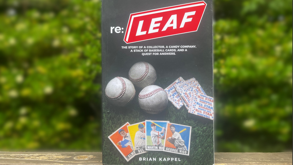
Brian Kappel’s writing about 1949 Leaf baseball cards is the kind of work the hobby needs more of. Specifically, it ties together far flung information that previously lacked narrative structure while making a compelling case for an underappreciated aspect of these fascinating cards.
But first, I need to admit something: I physically threw away a book.
Not gently slotted into the donation bin at the local library, but violently frisbeed out into the woods before I calmed down and transferred it to a trash can.
The offending pages were a hobby book that had been recommended to me but, like many titles in the baseball card space, it was so uninspiring and fundamentally lacking in craft that I couldn’t take it anymore. I even questioned the judgment and basic literacy of fellow collectors who raved about the title and wondered almost out loud if I needed to perform some sort of field test for concussion symptoms on the person passing along the suggestion. So when I tell you that Kappel’s book Re: Leaf on the 1949 Leaf baseball card set rises above this experience with both competence and genuine passion coming through its pages, understand that this is not faint praise. This is me acknowledging that someone finally put together something worth the paper it’s printed on.
Leaf cards occupy a peculiar space in the vintage card hierarchy. Their production and distribution are often discussed through as legends rather than historical facts, passed down in the storytelling tradition across convention center card show tables. The cards are inconsistent in print quality and for decades the hobby couldn’t even agree on when the things were actually issued.
If you’re going to have someone attempt to untangle the mess that is ’49 Leaf, you want a person who can look at varying ink densities and masking techniques on printing plates and actually know what they are talking about. Kappel, a collector of the set with a background in commercial design and family connections to industrial offset printing, is that person and he’s produced a work that accomplishes two critical things. First, he provides a respectable primer that brings readers up to speed on what actually happened with this set, separating fact from the mythology. Second, and more importantly, he makes a persuasive argument for the existence and collectability of dozens of variations within the first series cards that the hobby has largely ignored for three quarters of a century.
The physical dimensions of the book worried me when I first picked up my copy. The final words end on page 127, a total shamelessly inflated by the use of every trick known to high school students trying to meet the minimum length requirement of an essay. Chapter One does not start until page 7, meaning the actual content is even more compressed than the slim volume suggests. Ample illustrations, a large font, graphics strategically eating real estate between chapters, and suspiciously generous margins amplify this effect. However, textual volume cannot be what wins over readers, it had to be the ideas communicated in this narrow space. My hesitation fell away when I shifted to thinking of this as a workbook. The margins suddenly became a place to write notes when I began comparing my own cards to Kappel’s examples, and the thin size served as a springboard for further study rather than an all encompassing encyclopedia.
Kappel put in the requisite work before publishing. He conducted extensive back and forth conversations with the most knowledgeable Leaf experts, collectors like Ted Zanadakis who spearheaded efforts to pin down the set’s issuance date in 1949. Kappel has been active for years in the discussions of the set on the Net54 message boards. He is also a graphic designer by trade, and it shows in ways both large and small. The cover is exponentially better than the typical output from hobby writers, most of whom seem to think that slapping a card image on a generic background counts as design. There is thought put into the layout, the flow of information, and the way images support rather than interrupt the text. Much of what Kappel covers about Leaf’s history already exists scattered across the internet in forum posts, blog entries, and half-remembered conversations, but he’s done the valuable work of gathering it into a single coherent volume. He even made a field trip to the Chicago History Museum to dig through their archives, emerging with insights into the actual production process that produced these wonderfully inconsistent pieces of cardboard.
I need to pause here, because I don’t want this to be a book review about a primer on the manufacturing history a maddening set of baseball cards. I want this to be a gigantic flashing arrow pointing directly to Chapter Ten, which is where Kappel leaves the mark that will most affect the future trajectory of these cards’ story.
He begins by walking readers through three Leaf cards generally recognized as having multiple variations within the collecting community: Cliff Aberson (available with either long or short sleeves), Gene Hermanski (different spellings of his last name), and a colorful card of Cincinnati pitcher Kent Peterson. The Peterson card has been acknowledged as having two distinct variations for decades, with clear collector interest and different price points for each version. There is zero debate about this one. One version shows Peterson in a shadowy dark hat that looks almost black, like he’s some sort of film noir detective staking out a ballfield. The other version shows him in a bright red cap with zero shading or detail, as if someone took an eraser to the printing plate and said screw it, let’s just make this thing solid red and call it a day. This, as it turns out, is not far from what actually happened.
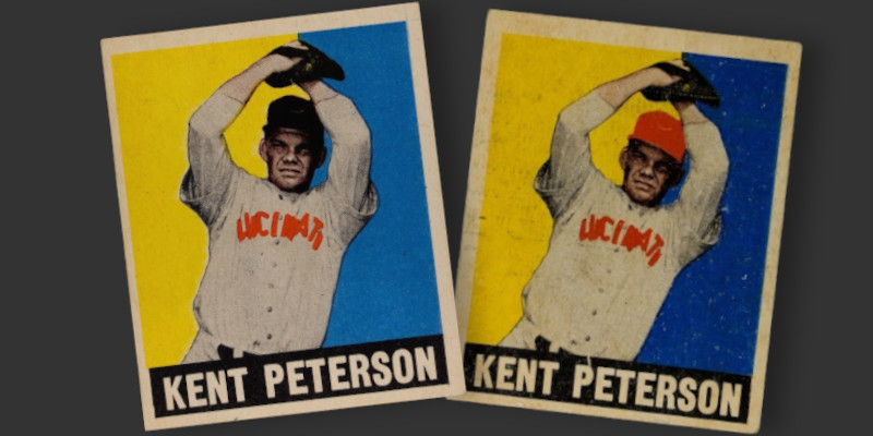
Kappel proceeds to explain how changes were made to the masking of the printing plates for first series cards, creating true variations rather than just the visual inconsistencies that come from varying ink levels. The Peterson card is the result of the black ink used for shadows and fabric details being masked off on the printing plate, allowing all the red underneath to show through unimpeded.
So far, so good. This is all well within the bounds of the accepted hobby canon. No master set is complete without the inclusion of both versions of these three names.
Here’s where Kappel takes things further: The same process of permanently changing the printing plates was applied to dozens of additional names in the set. He provides images of both variations for more than 30 cards beyond the three that everybody already knows about and systematically walks the reader through the process by which they would have come into existence. He does so while emphasizing that these are repeatable, distinct variations and not one of transient printing flaws that degrade the aesthetics of so many inconsistently printed cards.
For context, take a look at a couple of names from the checklist.
Like the Peterson card, many cards had adjustments made to the black ink applied to player caps. At some point in the production process, Leaf’s press operators applied modified printing plates that masked off the blank ink to player caps and extended colored backgrounds to specific background sections to create greater contrast. Changing a plate produces the widely accepted variations seen in many later sets, such as when 40 years later Fleer infamously inserted a black box over Billy Ripken’s bat or removed the cigarette advertisements in the background behind Randy Johnson. The Stan Musial card exhibits the exact same kind of variation in hat colors as the “officially” recognized Peterson card.
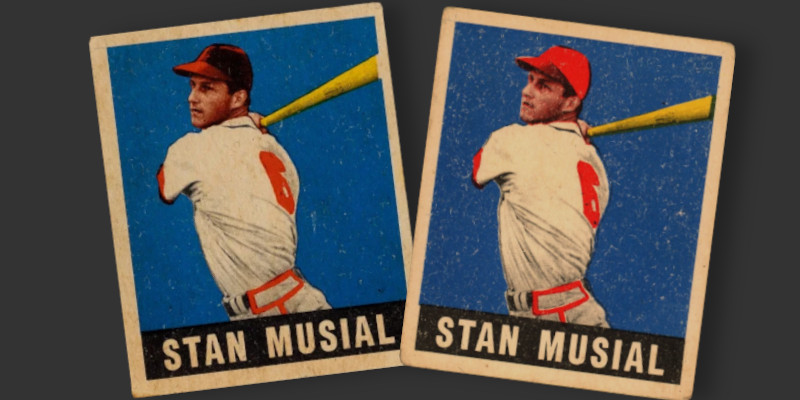
The difference between the two cards shown above isn’t the result of the pressman printing cards while running out of black ink. The color block nameplate clearly shows ample black ink flow, as do the details in Musial’s bat, face, and hat brim, all of which require unobstructed black ink application to be properly rendered. No transitional example exists where the hat has some detail, but not all. His hat is red on purpose.
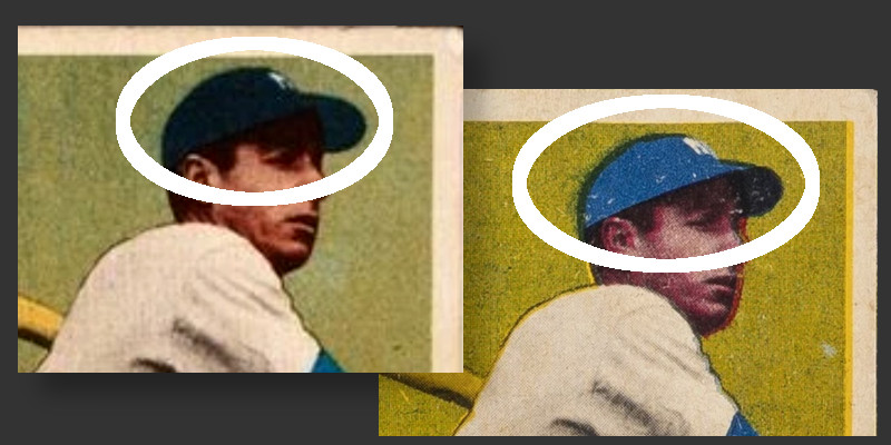
A closeup view of another card shows this masking at work. Look at the two images of Joe DiMaggio’s Yankees cap. The example on the left is very dark with the underlying blue ink making very little inroads against the black ink applied on top. The example on the right clearly shows the extent of the mask preventing the application of black ink. Again, this is a conscious design choice implemented by someone at Leaf that results in the same kind of distinct variation that has been clearly recognized by the hobby in the form of the Kent Peterson card.
Kappel makes it clear that these variations are specific changes to the printing plates and not print defects.
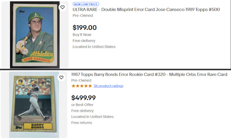
I need to pause here and address why the hobby has been resistant to accepting these variations, because it’s both understandable and frustrating. The baseball card world is plagued by hucksters and cranks who try to pass off garden-variety print defects as rare errors worthy of high end price tags. Go to eBay right now and search for a 1987 Topps Barry Bonds or 1989 Topps Jose Canseco and you’ll encounter a rogues’ gallery of sellers insisting that their cards with misaligned color registration or fish-eye printing defects or ink that rubbed off onto another sheet are rare, undiscovered variations that the hobby just hasn’t recognized yet. These people are exhausting, and the guardians of hobby databases and price guides have to deal with them constantly, listening to increasingly arcane theories about why their particular printing flaw is actually a valuable variation. So when Kappel approached these moderators with his evidence about 1949 Leaf variations, they heard him through the filter of a thousand previous conversations with delusional sellers.
Leaf cards are notorious for terrible print quality. Non-standard ink colors have long been documented with this release. Misaligned color registration is a recurring flaw that produces some truly wild looking cards. Centering is an adventure. Fish eyes and unbalanced color applications are present in any stack of randomly assembled cards from the set. The delusional “1/1 Error! Invest!” crowd would have a field day with ’49 Leaf.
The tragedy is that Kappel and the hobby insiders are talking past each other. He’s laying out evidence focused on changes made to printing plates, walking through the specific technical process by which any true, uniquely identifiable, repeatable variation can exist. He’s speaking the language of printing and production, explaining masking techniques and plate modifications. He lays it all out for them. But the insiders’ eyes glaze over because all they hear is the white noise of every crank who’s ever insisted that their off-center junk wax is secretly valuable. They politely decline to expand official recognition beyond the three accepted variations, and Kappel leaves these discussions frustrated, eventually deciding to write a book and take his argument directly to the wider collecting community.
I am fully convinced by Kappel. The man is not a crank, he’s not trying to pump up the value of his personal collection with spurious variation claims, he’s just someone with legitimate expertise being drowned out by the noise of wannabes selling garbage. His evidence is sound, his methodology is clear, and his conclusions are both reasonable and verifiable. Despite the inflated page count tricks, large margins and generous font, I found myself wanting to hear more from Kappel. This was the kind of detective work that makes collecting interesting rather than just an expensive exercise in checking numbers off a list.
One of my personal metrics for judging whether a book is actually good rests on answering a question: Does the book prompt me to take action, to do something with the information beyond just passively consuming it? Kappel’s work passes this test. I immediately started examining my own cards and thinking about next steps. Based on his work, I found myself wondering about the relative scarcity of each variation and trying to work out at what point in the printing process these changes to the plates actually occurred. I began my own research and out of the data emerged the outlines and timing of the relative print runs of these unrecognized variations. I look forward to sharing the results in my next post.
Questions like these make this hobby more than just filling holes in a checklist, and Kappel’s book is the kind of work that generates those questions. Whether the hobby establishment eventually comes around to officially recognizing these variations hardly matters. The evidence is out there now, documented and explained for anyone willing to look at their cards with fresh eyes and a bit of technical understanding. Thanks for writing this book Brian.
Brian’s book can be found on his website – https://www.releafbook.com/. In addition, he has made numerous appearances to discuss the book and expand upon the work of documenting variations within the checklist.